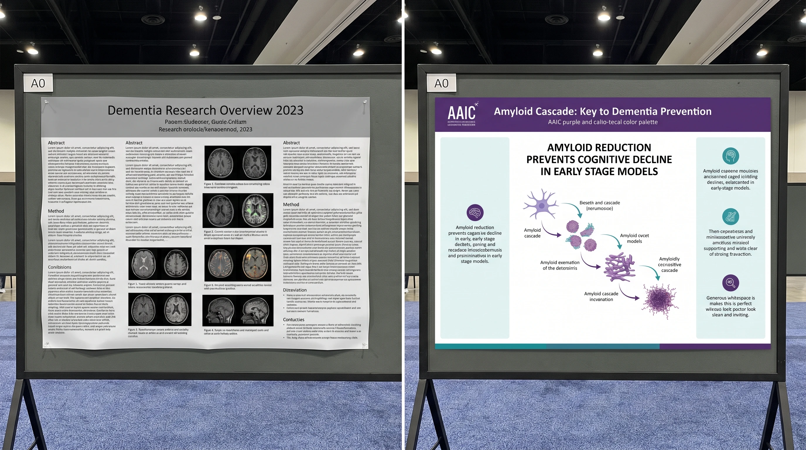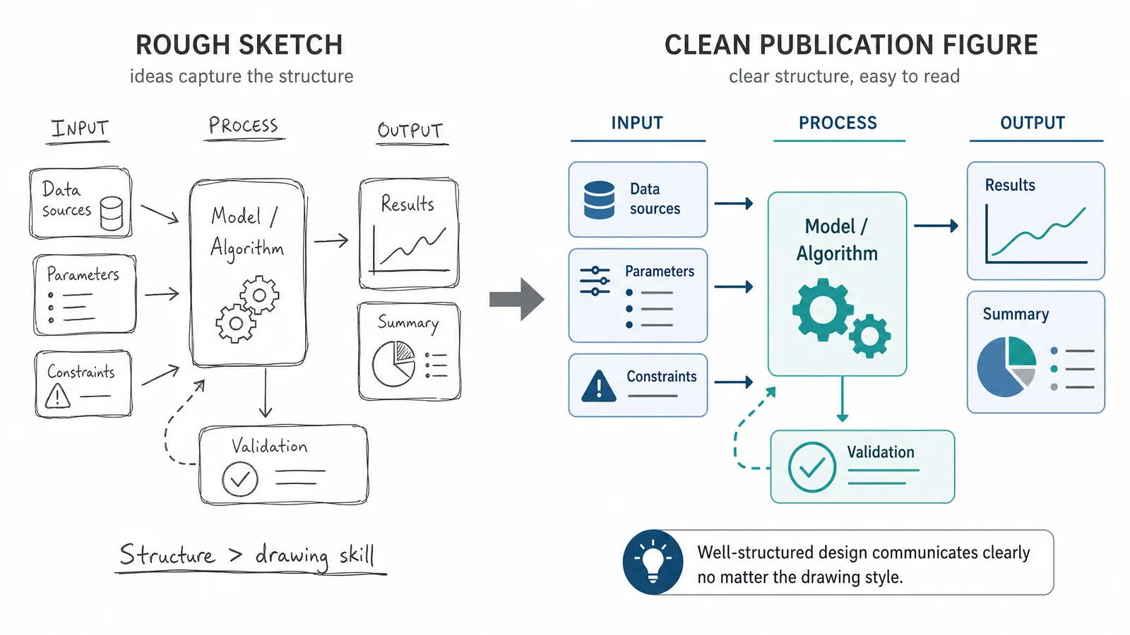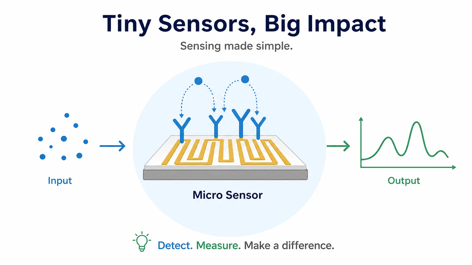

The typography on a scientific figure or poster is never neutral. It tells the reader, before they process the data, whether the work feels disciplined, contemporary, and readable or improvised, cramped, and amateur. A weak font choice can make strong science feel low-status; a strong one can make the same figure feel immediately publication-ready.
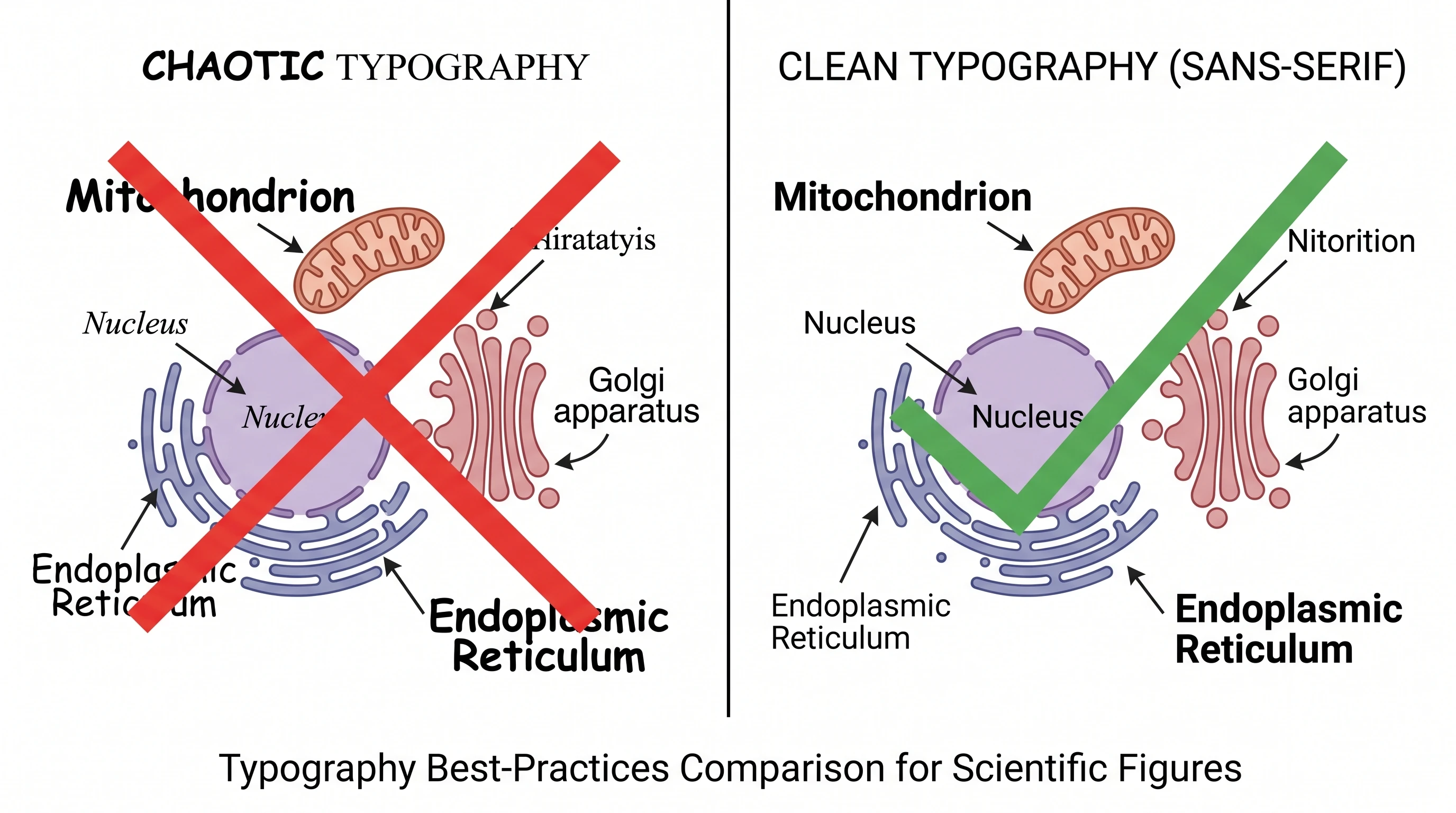
What Makes a Font Work for Scientific Communication
A font works in science when it disappears. Readers should notice the logic of the figure, not the personality of the typeface. That usually means choosing a sans-serif family with open counters, stable stroke width, and strong legibility at small sizes. If the letters collapse when the figure is reduced for a manuscript column or viewed from one meter away on a poster board, the font is not doing its job.
In practice, the best scientific fonts are clean sans-serif families with multiple weights and predictable numerals. You need headings, labels, axis text, and captions to feel like they belong to the same system. A typography stack that jumps between decorative choices may feel expressive in isolation, but it damages figure coherence fast.
Serif or Sans Serif?
l, uppercase I, and numeral 1 are hard to distinguish. Scientific figures are full of labels, concentrations, and codes. Ambiguous glyphs cost accuracy.Best Fonts for Scientific Posters and Figures
The best font for a scientific poster must stay readable at distance. The best fonts for scientific posters should also work for figure labels, axis text, and captions, so the same shortlist can support both poster and figure typography. Start with:
- Helvetica / Helvetica Neue — still a safe default when available
- Arial — less elegant, but widely available and readable
- Source Sans / Source Sans Pro — clean, open, academic-friendly
- Aptos / Calibri — practical for PowerPoint-heavy workflows
- Inter — excellent for digital posters and interface-adjacent visuals
The best scientific fonts share one trait: they stay legible in headings, body text, and labels without forcing you to switch families. Use one primary font and, at most, one secondary font. More than that and the poster begins to look stitched together.
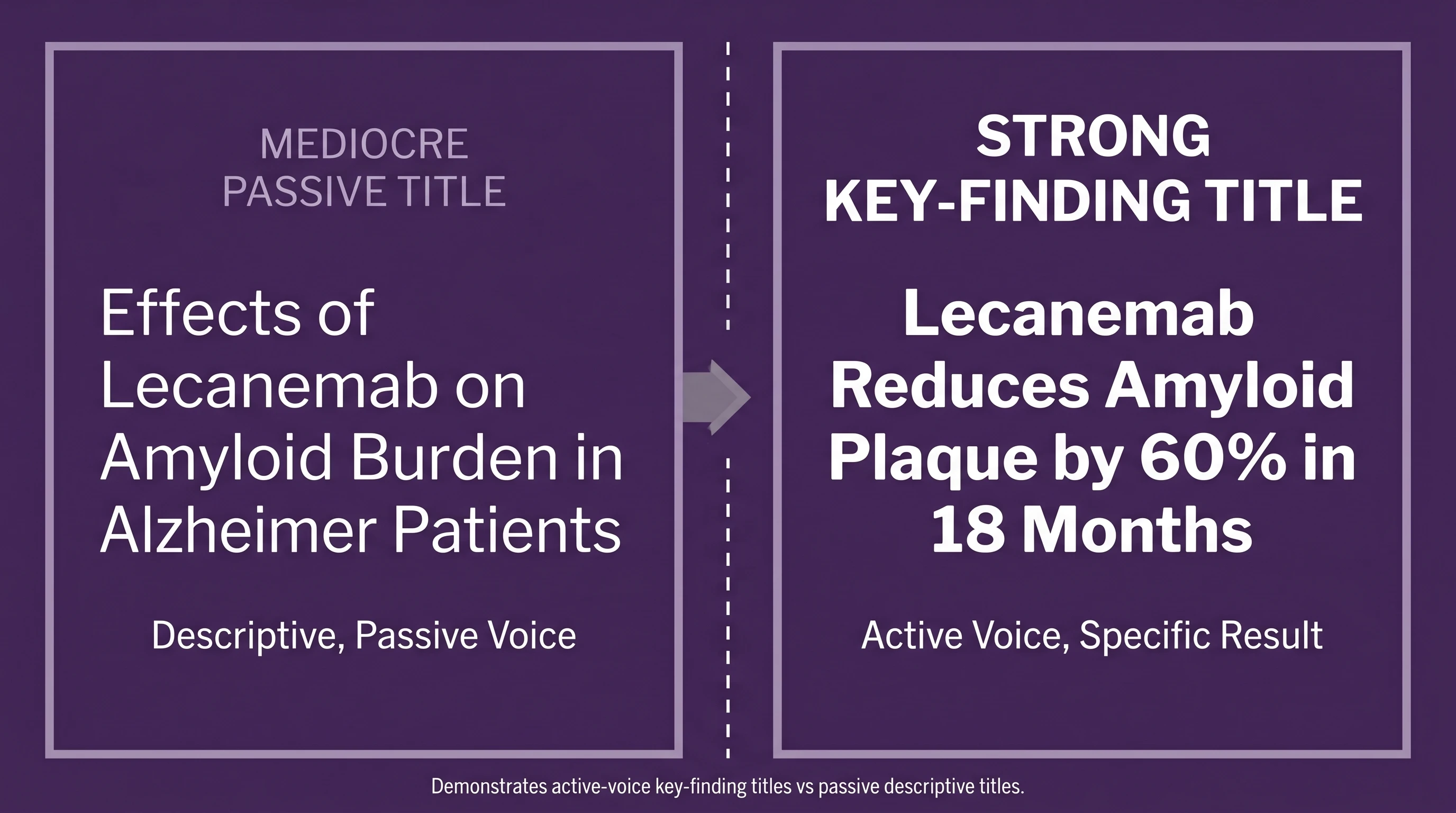
Font Size for a Scientific Poster
For an A0 scientific poster, a reliable baseline is:
- Title: 90-100 pt
- Section headings: 50-60 pt
- Body text: 30-36 pt
- References / fine print: 28-30 pt when absolutely necessary
That range is not decorative guidance; it is readability guidance. The title should work from several meters away. Body text should still be readable from about one meter away. If you find yourself shrinking below those sizes just to fit more text, the problem is not typography. The problem is that the poster is carrying too much prose.
Font Size by Poster Size
Use 90–100 pt for an A0 title, 72–80 pt for A1, 56–64 pt for A2, and 42–48 pt for A3; scale section headings, body text, and captions with the table below.
| Poster size | Title | Subtitle / section heading | Body text | Figure captions |
|---|---|---|---|---|
| A0 | 90–100 pt | 50–60 pt | 30–36 pt | 28–30 pt |
| A1 | 72–80 pt | 40–48 pt | 24–30 pt | 20–24 pt |
| A2 | 56–64 pt | 32–40 pt | 18–24 pt | 16–20 pt |
| A3 | 42–48 pt | 26–32 pt | 14–18 pt | 12–16 pt |
Treat these ranges as starting points, then check the exported poster at its final physical scale. If the body text only fits after you drop below the minimum, cut copy or simplify the layout instead of sacrificing readability.
Font Size for Figure Labels, Axes, and Legends
Poster typography and figure typography are related, but they are not the same job. A poster title has to win at distance. A figure label has to survive reduction, export, and often a journal column width. That means the font size logic inside a figure should usually be tighter and more disciplined than the surrounding poster text.
For manuscript figures, a practical starting range is:
- Panel labels: 12-16 pt equivalent
- Axis titles: 10-12 pt
- Tick labels: 8-10 pt
- Legends / callouts: 8-10 pt
The exact number depends on the export size, but the principle does not change: if you must zoom to read a label on screen, reviewers will struggle with it in PDF form too. Scientific figures are often reduced during manuscript layout, so what looks acceptable at 140% zoom in Illustrator or PowerPoint can become unreadable in the actual paper. Good scientific fonts protect you here because they stay open and distinct even when the label size is modest.
The easiest way to test this is brutally simple. Export the figure, drop it into a draft page layout, and view it at the final scale. If the axis text feels smaller than the data marks deserve, fix the scale now. Typography problems get harder to see once the poster or manuscript is already “finished.”
Font Hierarchy Matters More Than Font Taste
Readers do not experience poster typography as a list of font sizes. They experience it as hierarchy. The title has to dominate. Headings must clearly step down from the title. Body text should support, not compete. If headings and body text sit too close together in size, the poster loses navigability even if every line is technically legible.
This is why the best conference posters often look “simple.” Their typography makes the reading order explicit. The viewer knows where to land first, where to go second, and what can be skipped if time is short.
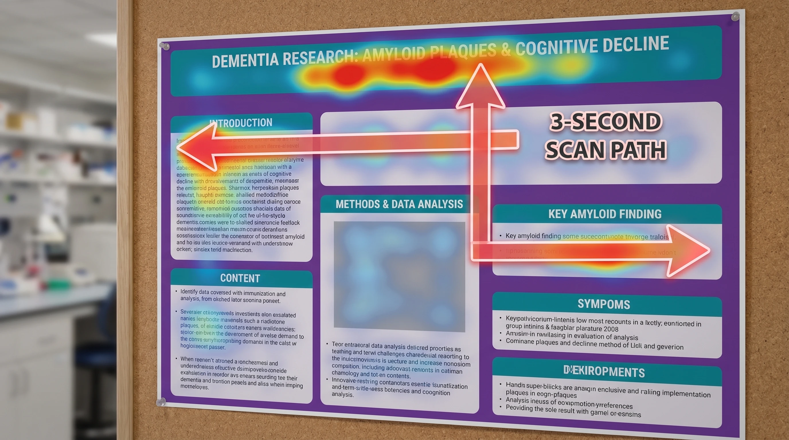
Common Scientific Typography Mistakes
The first mistake is using too many fonts. The second is making body text small enough that only the presenter can read it. The third is relying on all-caps headings that become hard to parse when they are long. The fourth is mixing elegant display typography into a poster that really needs clarity more than personality.
The fix is boring in the best possible way: one strong sans-serif family, one clear size hierarchy, one consistent weight system, and enough whitespace that the text can breathe.
Scientific Poster Typography vs Figure Typography
One reason typography drifts so easily in research visuals is that posters and figures are often assembled in separate tools by separate habits. A scientist may use a default PowerPoint font for the poster shell, inherit a journal-style font from a Prism export, and paste in a mechanism figure whose labels were generated somewhere else entirely. None of those choices is individually catastrophic; together they make the final poster feel patched rather than designed.
The solution is not “more design.” It is one explicit typography policy. Decide the main font family, define how many weights you will use, and choose one numerical scale for title, section heading, body, figure label, and caption text. Once that system exists, every figure you add either fits or gets adjusted. That is how strong poster typography is built in practice: not from one magic font, but from consistency across repeated decisions.
This also explains why so many strong posters feel calmer than the average academic board. They are not full of clever type choices. They are full of repeated, disciplined ones.
A Typography Checklist Before You Export
Before exporting a poster or figure, run a last typography check:
- Can you distinguish
1,I, andleverywhere they appear? - Are title, heading, and body text clearly separated by size and weight?
- Are axis labels and legend text still readable at final output scale?
- Is one font family doing most of the work instead of three unrelated ones?
- Does every label look intentional when the figure is reduced?
This final pass matters because typography errors rarely look dramatic while you are editing. They become obvious only when the file is projected, printed, or seen from three steps away. A one-minute export check prevents that embarrassment.
It also protects downstream reuse. The same figure may end up in a poster, a manuscript, a lab slide deck, and a social teaser. A disciplined typography system makes that reuse far less painful because you are not rebuilding readability from scratch in every format.
How SciFig Fits In
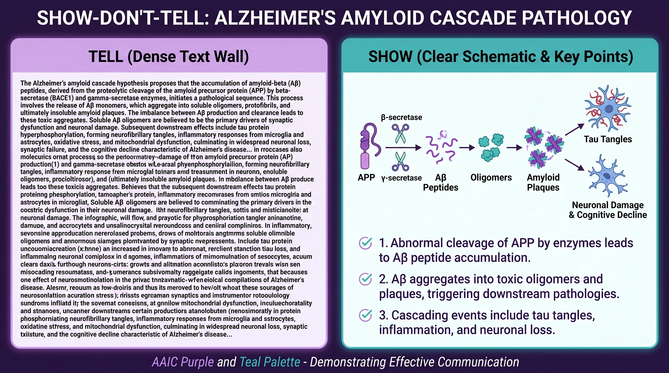
See AI Scientific Figure Generation in Action
Watch how researchers create publication-ready scientific figures from text descriptions.
Explore the ToolRelated reading: 18 Scientific Poster Examples to Learn From in 2026, Best Color Palettes for Scientific Figures (2026).