
What a Good Research Poster Template Actually Does
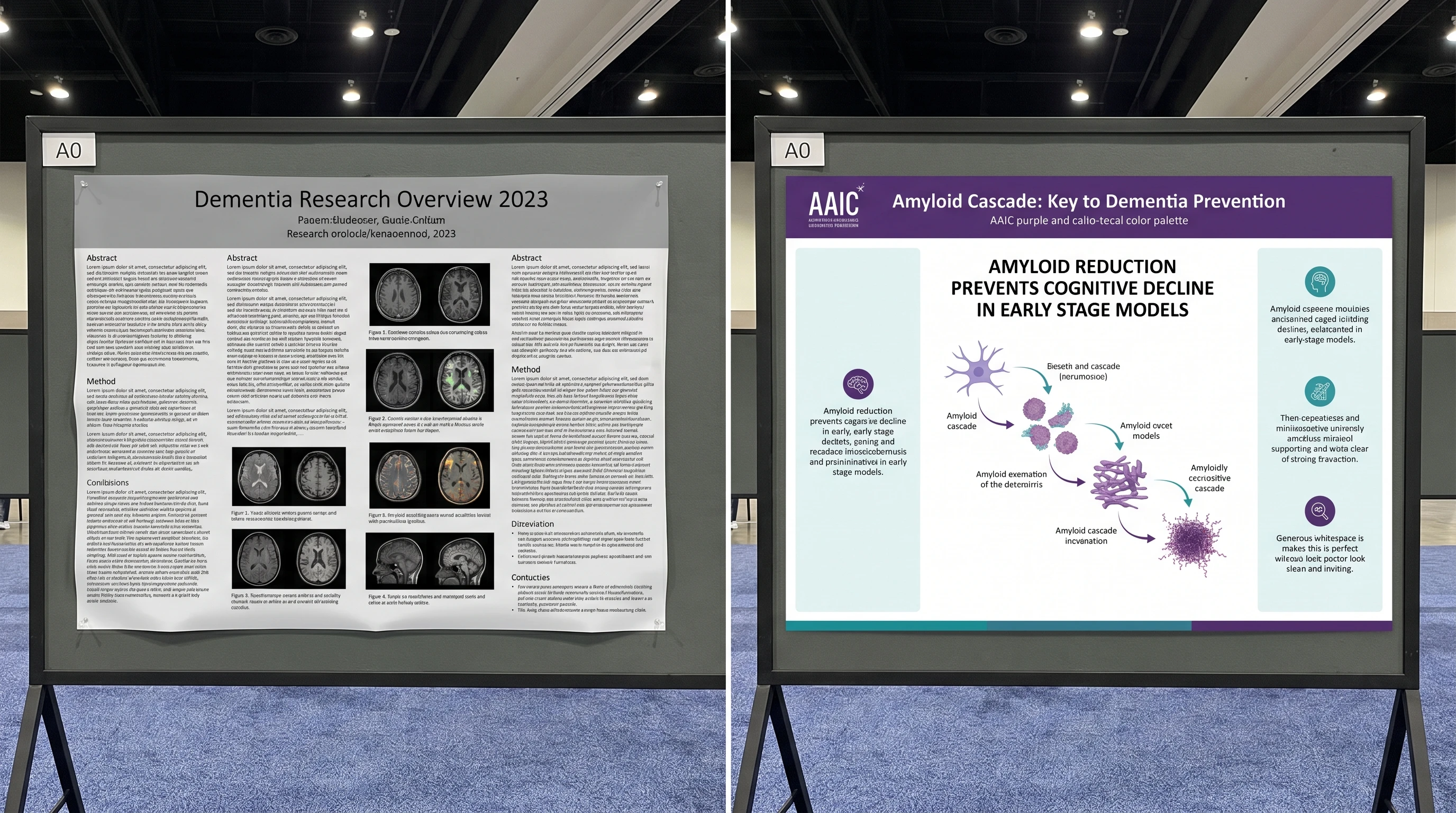
Bad templates fail on exactly those three points. They give you too many boxes, too much text area, and no opinion about what the reader should see first. That is why the best templates are usually simpler than researchers expect: fewer regions, one hero figure, one headline result, and just enough support material to make the claim credible.
Four Poster Template Patterns That Work
The most reusable poster structures fall into four patterns.
- Portrait academic poster: the classic conference format, useful when the venue still expects an A0 or 36×48 board.
- Landscape poster: best when your results are best explained left to right rather than top to bottom.
- Single-screen digital ePoster: ideal for hybrid or virtual meetings, where scrolling kills comprehension.
- Thesis or PhD poster template: best when you need a slightly denser evidence structure but still want one dominant finding.
The right choice depends on the reading environment. A print board rewards chunking and distance legibility. A digital poster rewards compression and a stronger headline-to-hero-figure ratio. A PhD poster often needs more context than a short conference abstract, but it still cannot behave like a manuscript.
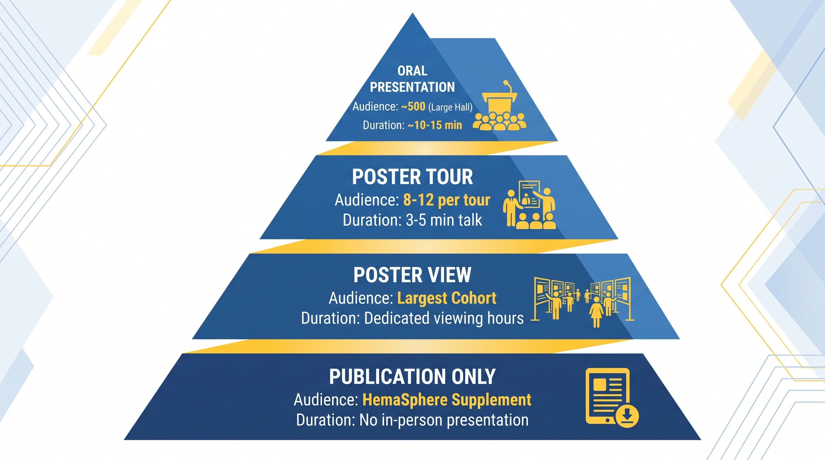
What a Research Poster Usually Needs to Include
That distinction matters because many researchers choose templates by asking, “Where can I fit all my sections?” The better question is, “What structure helps one result survive first contact?” The moment you ask that second question, you naturally start preferring templates with fewer equal-weight boxes and more support for one hero panel. In other words, the best research poster template is usually the one that forces prioritization earliest.
When a Scientific Poster Maker Beats a Static Template
That is why many researchers stall after downloading a template. The template gives them columns, but it does not give them the one figure the audience will remember. A poster maker closes that gap by helping generate or refine the hero visual first, then wrapping the rest of the poster around it.
Static Template vs Poster Maker vs Slide-Deck Workflow
Researchers usually end up choosing between three real workflows:
- Static template: best when your structure and figures are already settled
- Poster maker: best when you still need help building the visual center
- Slide-deck workflow: best when your lab is deeply committed to PowerPoint or Keynote
The static template route is efficient only when the scientific narrative is already compressed. If you still do not know which result should dominate, the template only gives you the illusion of progress. A poster maker is more useful in that moment because it helps decide what the audience should see first. The slide-deck workflow remains common because everyone can open it, but it often inherits the weaknesses of presentation thinking: too much text, too many equal boxes, and weak hierarchy.
That is why poster making is less about software loyalty and more about choosing the stage where you need help. If your problem is layout, use the template. If your problem is focal structure, use the maker. If your problem is lab-wide compatibility, accept the slide deck but impose stricter poster rules.
A Fast Poster Workflow with SciFig
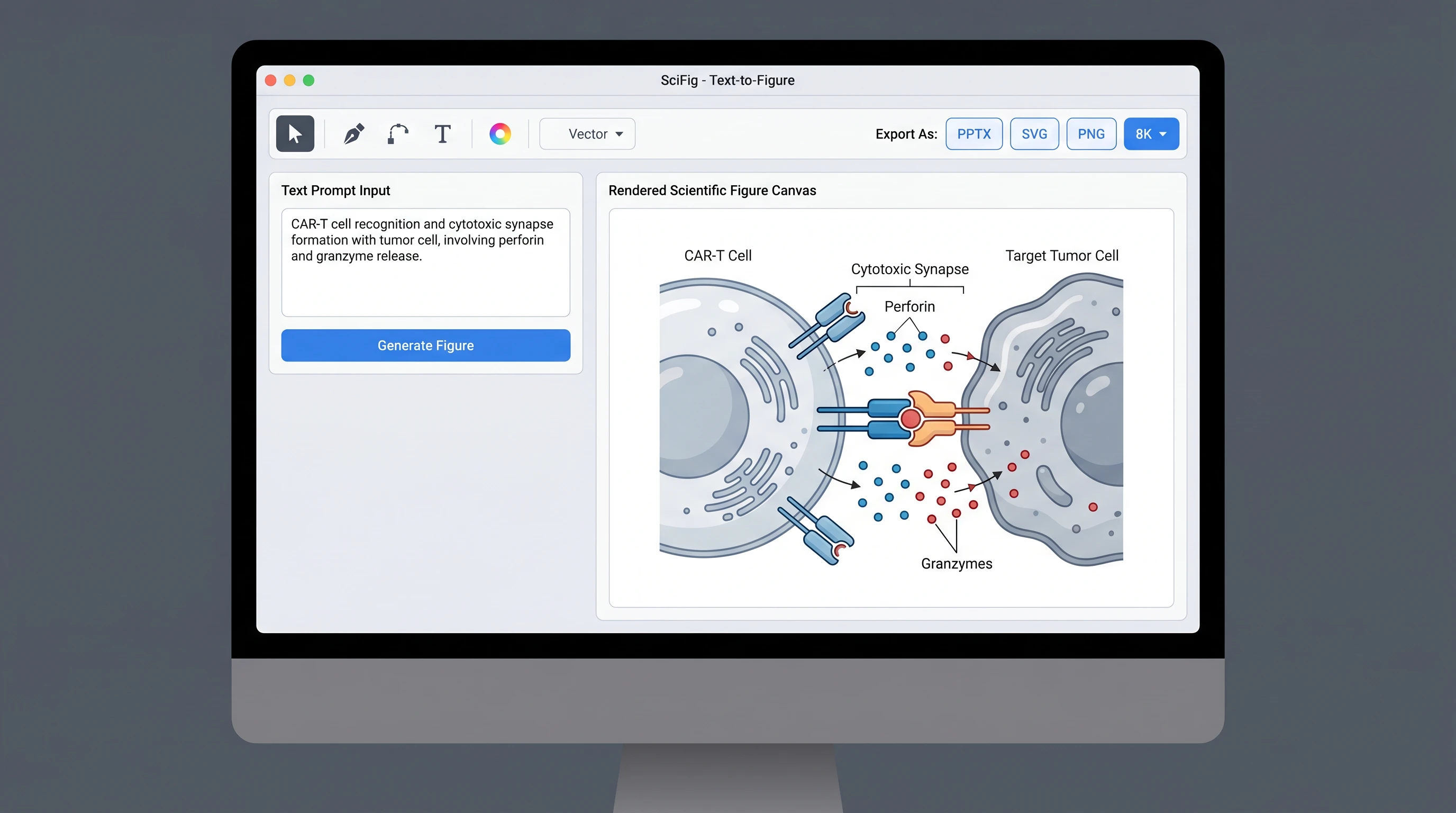
See AI Scientific Figure Generation in Action
Watch how researchers create publication-ready scientific figures from text descriptions.
Explore the ToolWhat PhD Poster Examples Really Teach
That last point matters. Researchers often copy the visible surface of a good poster — the color palette or section order — while missing the deeper lesson: the best posters have already decided what to delete. A useful poster example is therefore not one with the most information, but one with the clearest sacrifice.
A Checklist Before You Commit to a Template
Before locking a template, ask five questions:
- Does the structure make one result more important than the rest?
- Can the poster be understood in under 20 seconds from two meters away?
- Is there an obvious place for one hero figure instead of four medium ones?
- Does the format fit the actual venue: print board, screen, or hybrid session?
- If you removed 30% of the text, would the template become stronger or collapse?
That last question is especially useful. Good templates get stronger when you simplify into them. Weak templates only function when they are overfilled. If your layout needs excess text to feel complete, it is usually compensating for a structural problem rather than solving one.
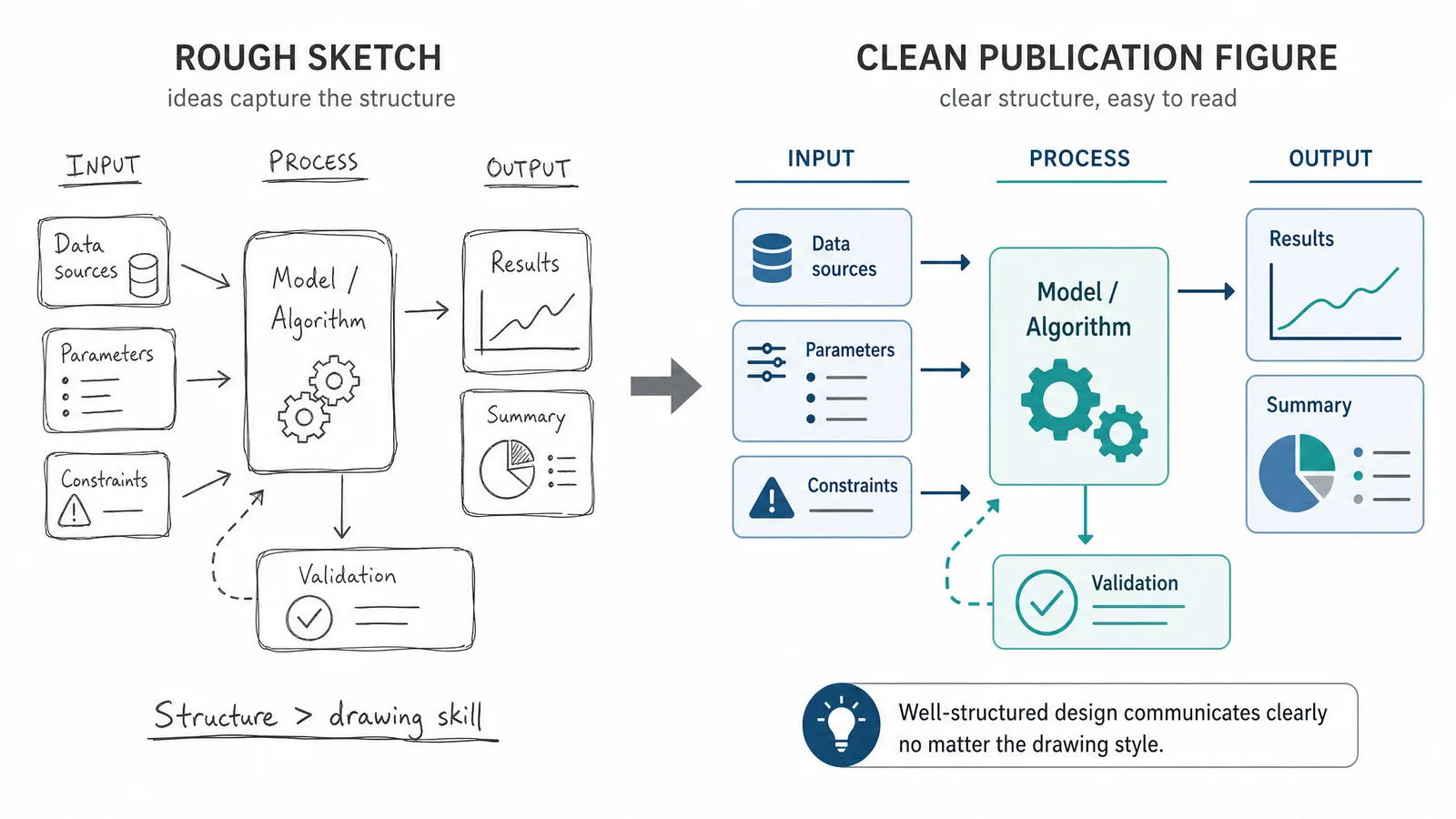
This is also why experienced presenters often sketch the poster in plain boxes before opening any software. If the information hierarchy is not convincing in grayscale, it will not be rescued by a prettier template later.
Common Mistakes When Choosing a Poster Template
The first mistake is choosing a template because it looks “full” rather than because it supports one message. The second is choosing a layout before you know what the hero figure is. The third is forcing a print-style template into a digital conference format or vice versa. The fourth is assuming a PhD poster needs more text when it usually needs better compression.
The fix is simple: start from the message, then the figure, then the format. If the template cannot support that order, it is the wrong template.
How to Build the Poster Around One Figure
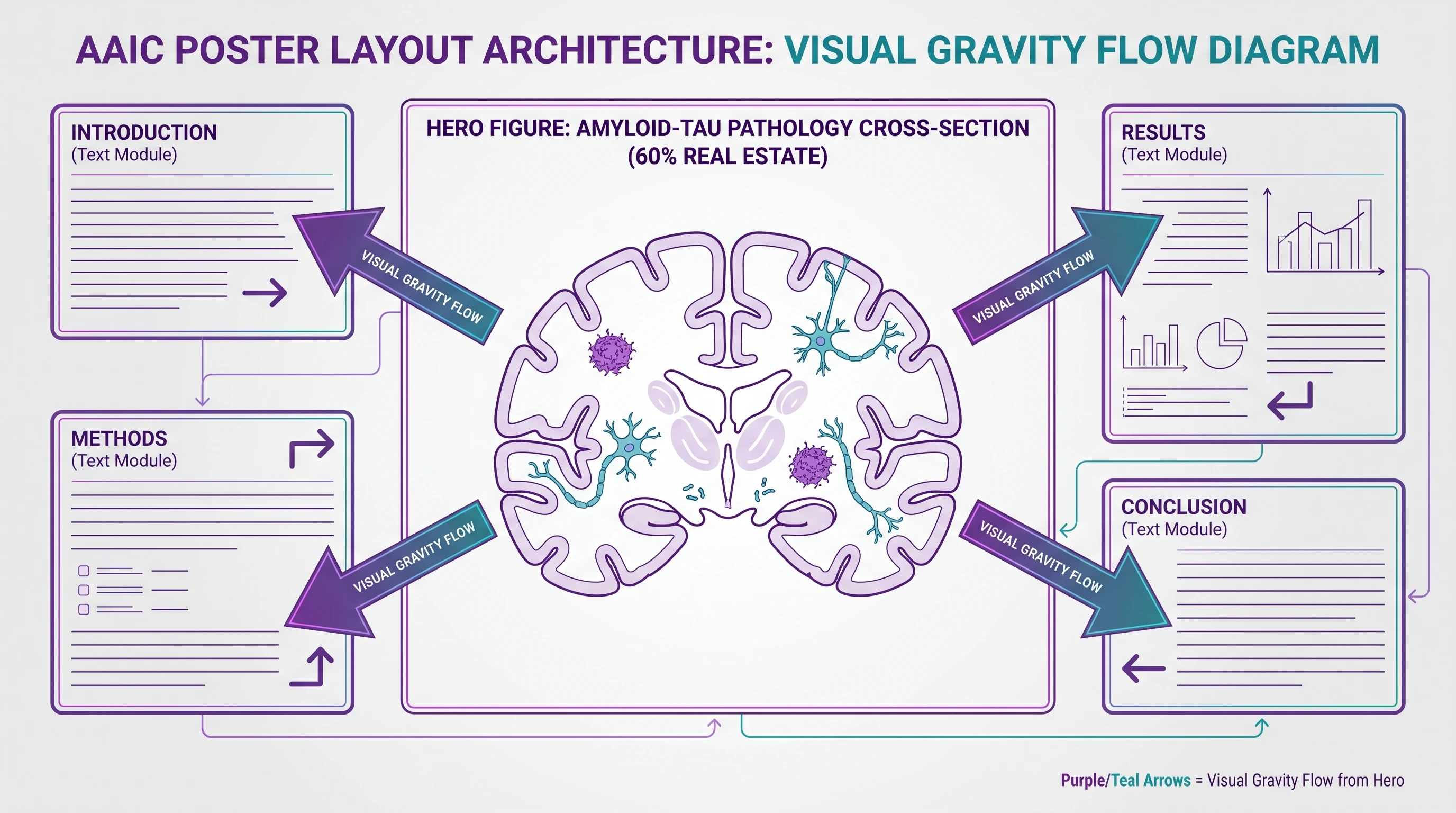
The best conference posters are rarely “balanced” in the abstract sense. They are intentionally uneven. One figure carries most of the cognitive weight, and the rest of the board exists to support it. That means the main panel should usually be chosen before the surrounding text is finalized.
In practice, this changes how you build the poster. Instead of writing every section and then searching for spare space for graphics, you decide what the audience must remember, turn that into the visual center, and then write only the amount of text needed to make that center interpretable. This is also why a scientific poster maker can be valuable even if you later finish in PowerPoint: it helps establish the focal hierarchy before layout sprawl begins.
Create Scientific Figures Now
Describe your scientific figure in natural language — get publication-ready illustrations in minutes.
Try FreeRelated reading: 18 Scientific Poster Examples to Learn From in 2026.