
Kaplan-Meier Survival Curve
Create a clean Kaplan-Meier survival curve with stepwise drops, censoring marks, and publication-ready survival analysis layout for your manuscript or poster.
Figure prompt
Describe the figure you want to create
Subject / Details (e.g., a process flow, key labels, visual style)
Not sure where to start? Use Example.
Start with 100 free credits|No credit card required
Get up to 300 free credits on day one when you join through an invite.
Reviewed by SciFig TeamUpdated
Kaplan-Meier Survival Curve— templates & examples
Everything you need to generate a Kaplan-Meier survival curve
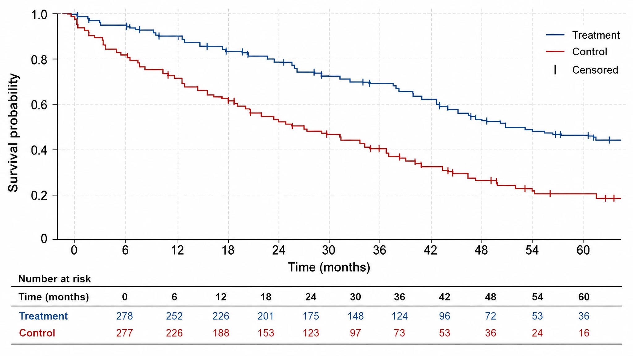
Build a clean stepwise survival plot fast
SciFig creates a Kaplan Meier survival curve with the expected staircase logic, labeled axes, and publication-ready layout. You go from study concept to a finished figure in minutes, without hand-drawing every step and censoring mark.
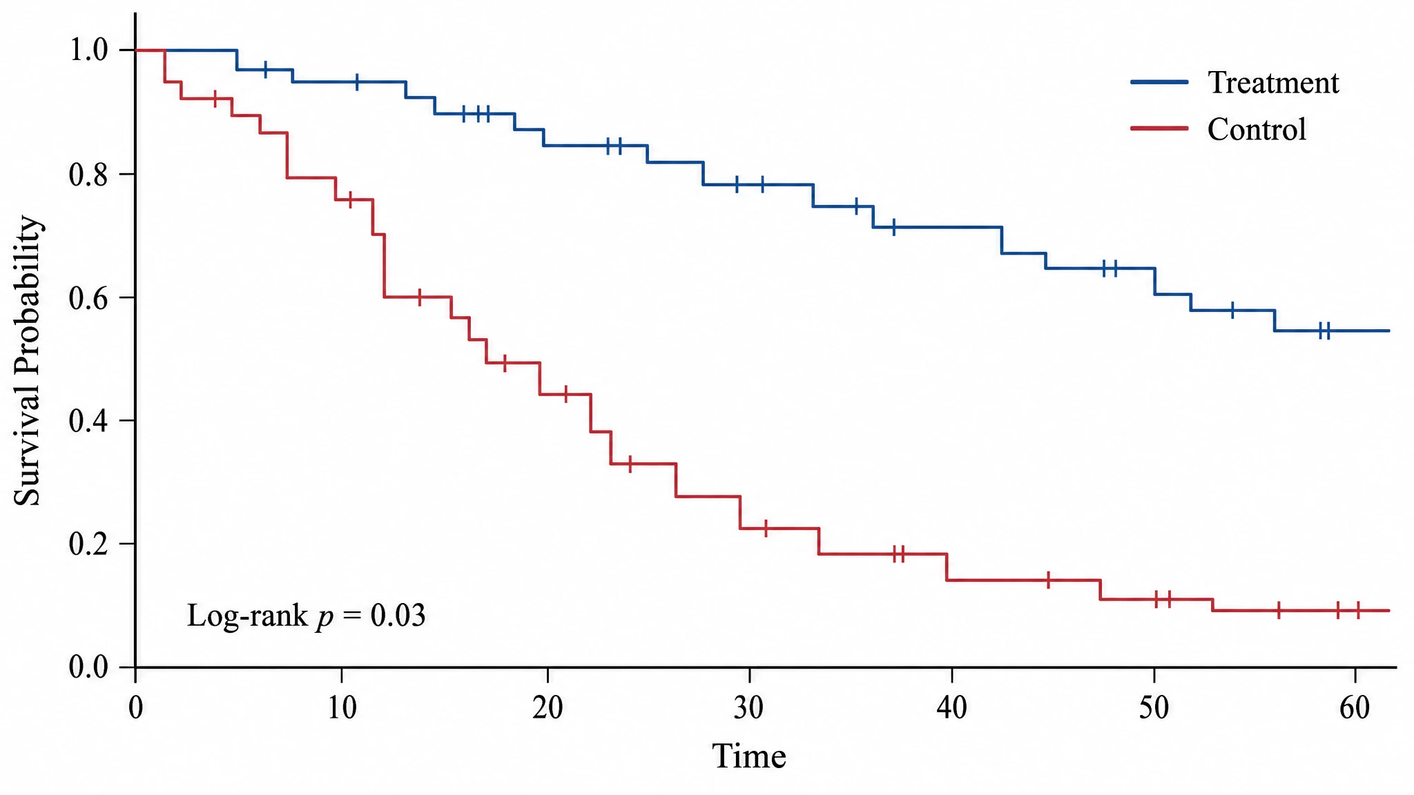
Compare treatment and control groups clearly
A KM survival curve matters most when readers can see separation between groups. SciFig lets you present two or more groups on shared axes with a clean legend, clear spacing, and a layout that supports statistical interpretation instead of obscuring it.
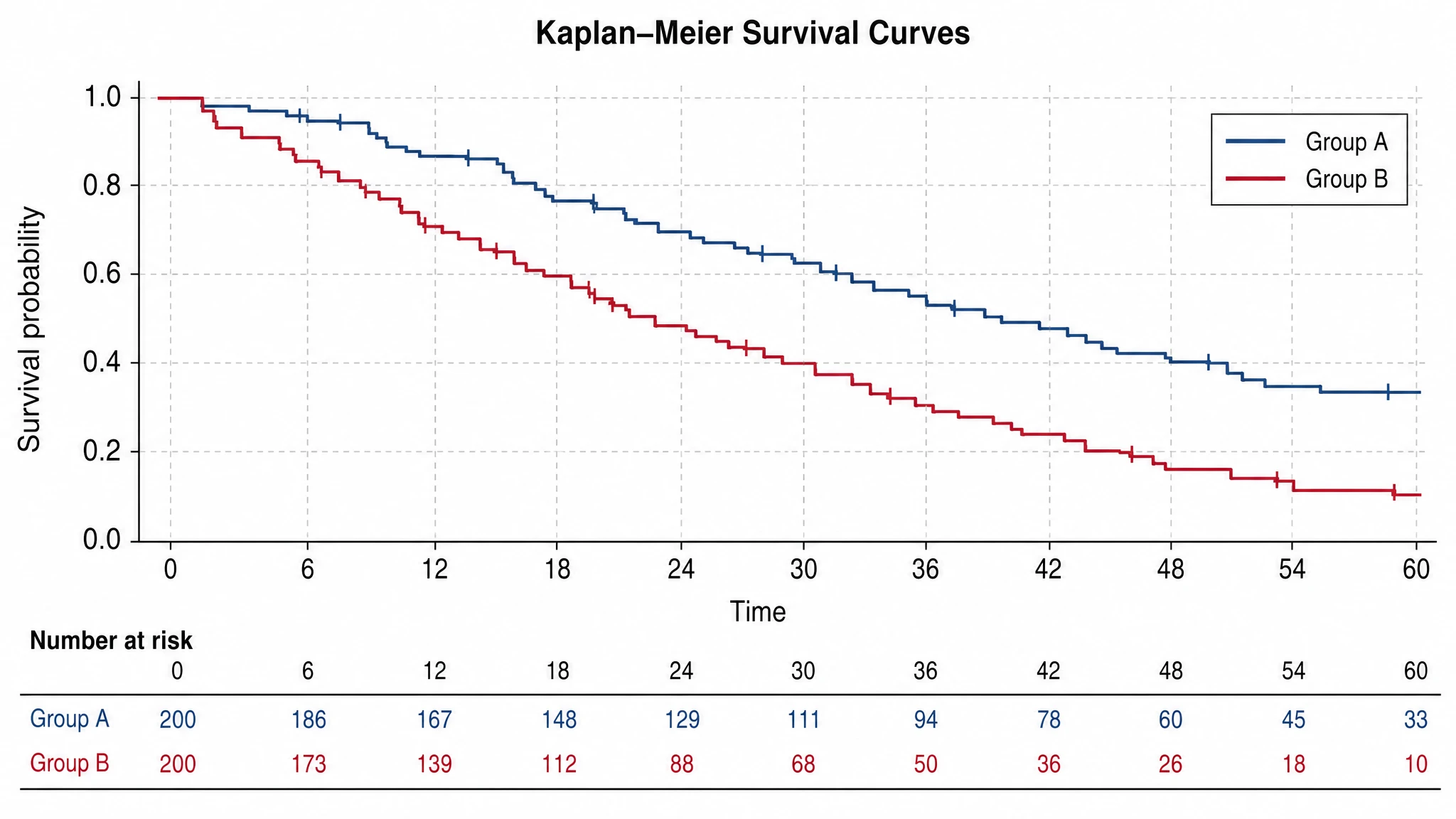
Add the context reviewers expect
Number-at-risk rows, censoring marks, and clean axis labeling are what make a time-to-event figure easy to trust. SciFig packages those cues into a plot that reviewers can read without guesswork, in papers, slides, and posters.
What is a kaplan meier survival curve?
A Kaplan Meier survival curve is a stepwise plot showing how survival probability changes over time for one or more groups in a study. Researchers rely on the Kaplan–Meier estimate because it combines event timing, censoring marks, and a number-at-risk table in one readable figure. With SciFig you generate a publication-ready version of that plot, then relabel, compare, and export it.
Why a Kaplan-Meier survival curve matters
- Survival curves are the standard visual for time-to-event analysis
- Stepwise survival plots make group differences easier to interpret than raw tables
- Censoring marks and number-at-risk context improve trust in later time points
- A clean survival curve graph supports manuscripts, posters, and slide decks
- Kaplan-Meier plots remain one of the most recognizable figures in clinical and translational research
Key components of a Kaplan-Meier plot
- Time on the x-axis
- Survival probability or percent survival on the y-axis
- Stepwise survival lines for one or more groups
- Tick marks for censored observations
- Legend identifying the groups
- Optional number-at-risk table below the axis
Where Kaplan-Meier survival curves are used
- Clinical trial reports
- Retrospective outcome studies
- Cancer survival analysis
- Drug-response comparisons over time
- Conference posters and manuscript figures
How to make a kaplan meier survival curve
Describe your kaplan meier survival curve
Tell SciFig what to draw in plain language — no design tools required.
Generate with SciFig
Get a clean, publication-ready figure that matches your description in seconds.
Edit & export
Vectorize it into editable SVG, relabel everything, and export for your paper, poster, or slides.
Kaplan-Meier Survival Curve — Frequently Asked Questions
Common questions about Kaplan-Meier Survival Curve.
More tools

Circuit Diagram Maker
Generate accurate circuit diagrams with labeled schematic symbols for research papers, lab reports, and technical publications.
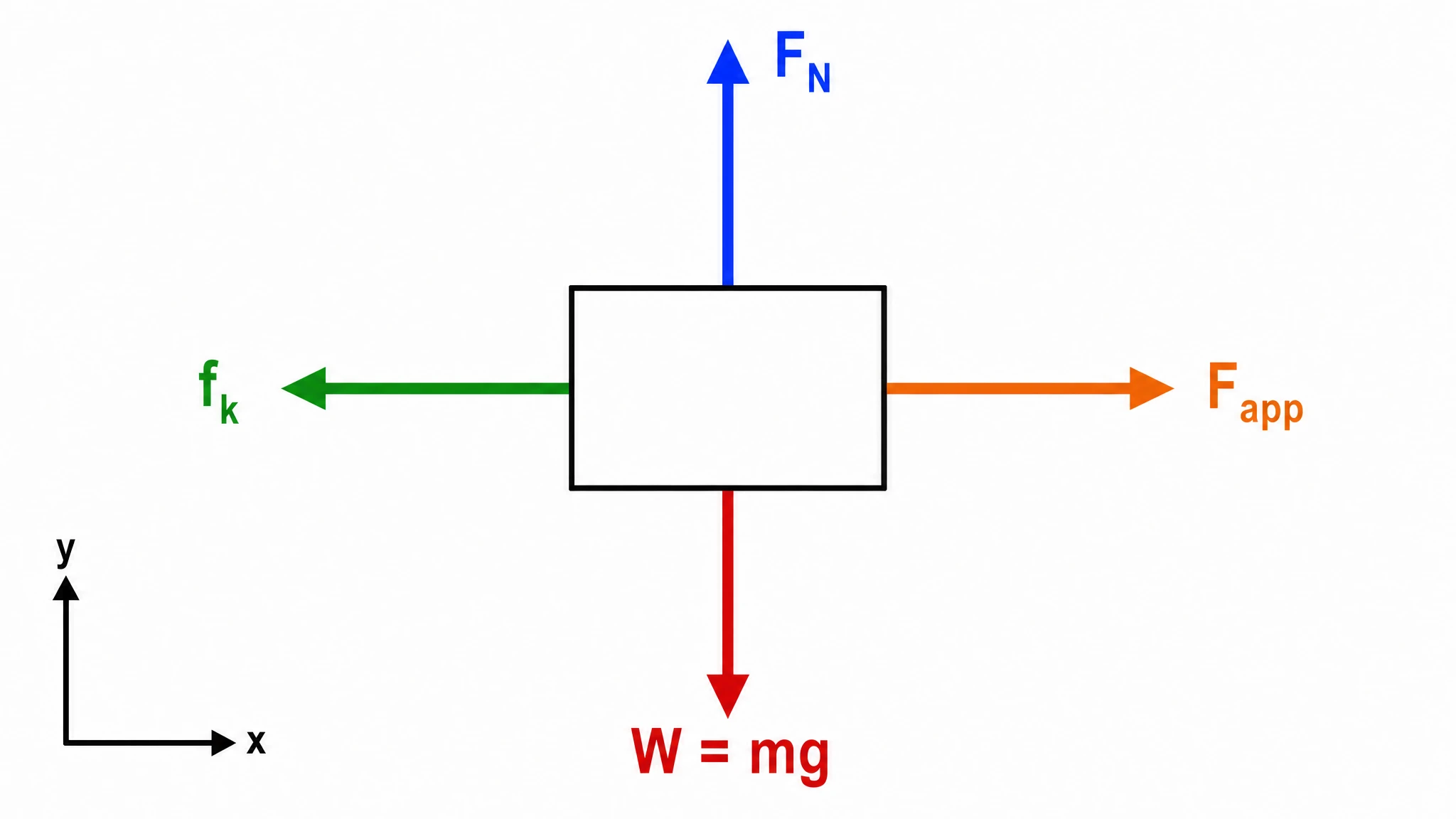
Free Body Diagram Generator
Create accurate, publication-ready free body diagrams with labeled force vectors for weight, normal force, friction, and tension in seconds.
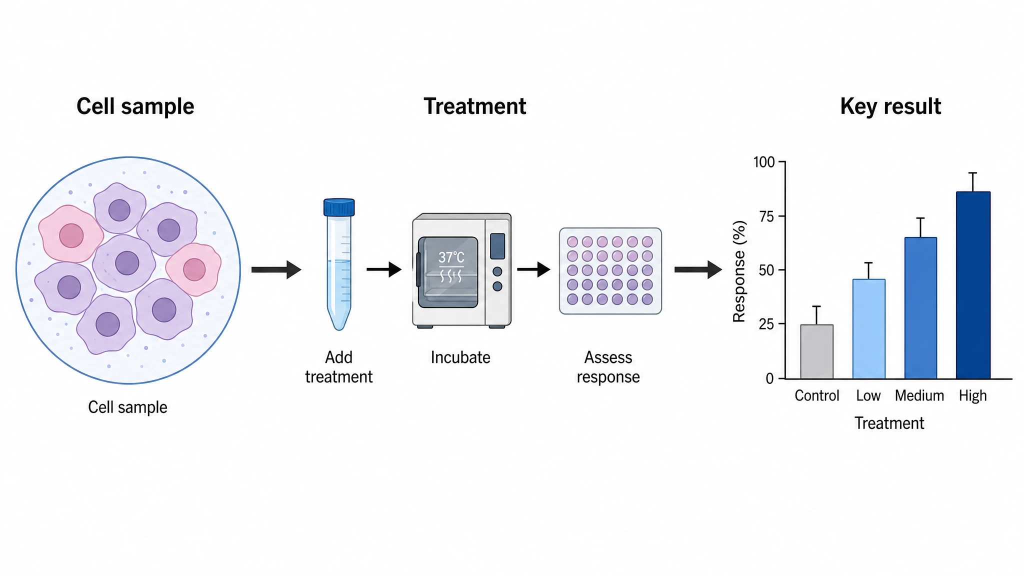
Graphical Abstract Maker
Generate a publication-ready graphical abstract — a single-panel visual summary that captures your study's methods, key finding, and result with clear icons and flow arrows.
Home
Free AI Scientific Figure Generator and Figure Maker — Create Research Figures, Images, Illustrations and Diagrams
Text-to-Figure
Generate a figure from a plain-language description
Models
Default to GPT Image 2 for journal papers; switch to Nano Banana Pro for slides and posters; pick Nano Banana 2 for routine figure work
Tutorials
Seven short walkthroughs of the AI scientific figure generator
Blog
Tutorials, tool comparisons, and publication tips for researchers.
Inspiration
Explore publication-ready scientific figure examples, copy the prompts, and use them as starting points for your own work.

Ready to publish?
Make your own kaplan meier survival curve in minutes.
Start for freeFree to start · No credit card required · Built for researchers